How can you demonstrate to the Ombudsman and the regulator that you’re in control of your data and are adhering to the service standards they have set out? They both want the same thing (for social housing residents to have a positive experience) but their standards and approach are very different. In order to satisfy both, the Ombudsman’s case-by-case mentality is the best place to start.
We’ve conducted a wee bit of research into exactly which issues the Ombudsman typically passes a maladministration judgement on. Our findings will help you understand which areas should be prioritised, and our framework will help you stay on the right track when it comes to drawing these priorities from customer data.
The problem with TSMs
The yearly tenant perception survey TSMs mandate will set a benchmark for measuring HAs against each other. It will tell you which areas you are falling behind in, and what your customers are happiest with.
What it will not tell you is why, or what you should do about it. When it comes to these (really quite key) considerations, the Ombudsman is the one you need to worry about. Many of the high-profile maladministration cases recently are not strictly from lack of trying; they are often a result of individuals working with limited context on their customers’ situations. So how can you use your customer data to actually improve tenant lives?
Papa John Smurf
Well, dear reader, turns out it’s not as hard as it sounds. Wordnerds has developed a framework that provides a clear process on how to prioritise your data once it has been collected and categorised.* With it, you will be able to evidence a robust process if there is any external scrutiny, and more importantly you will be able to make changes to your service provision based on what your customers are telling you. Because that’s the whole point, right?
*Holy tintinnabulation Batman, how do we collect and categorise our data in the first place? Well, Robin, when a housing management system and a text analysis platform love each other very much… they speak to Wordnerds about the most efficient way to get it done.
We call this methodological wunderkind the PAPA Framework. (There is some discussion in the Wordnerds office, divided apparently down generational lines, whether its nickname is Papa John’s or Papa Smurf. One Barbara Stresiand-enthused outlier insists on the Papa can you hear me Framework. Get in the comments with your team.)
Right, back on track… the PAPA framework. It stands for Performance, Alerts, Priorities, and Action. It will get you from having collected those mountains of data points to using them across your organisation to improve customers’ lives. So let’s get to it…
Performance
Your goal with this stage of the framework is to give time-poor team members an at-a-glance understanding of how your tenant satisfaction is doing.
To track top-level performance over time, what you need is a North Star metric — the single leading indicator that you can share with colleagues, senior leadership, or random strangers off the street (who are permitted to see internal reporting stats).
This metric should incorporate the core value you deliver to customers (say, satisfaction or sentiment score across TSM categories) while accounting for major risks (for instance, sentiment on or number of alerts triggered — more on that shortly). Depending on the respective sizes and volatility of these numbers, you can either subtract or divide one by the other. This will give you a single North Star to follow month on month, three kings style, that will provide that first-look insight into what’s happening below the surface.
Alerts
Your goal with this stage of the framework is to find individual issues within your datasets that will cause major problems for your tenants and your organisation.
Told you we’d get to it shortly! Alerts are critical in an industry with stakes as high as housing. By alerts, we mean a (preferably automated) process by which critical patterns or terminology are flagged for attention. For instance, a comment saying “the way my complaint was handled was abysmal” or the third report of damp and mould from the same property in a three-month period would both trigger alerts. Anything that indicates a customer could be at risk, or that there is a chance of escalation to the Ombudsman, should trigger an alert.
“But how do we tell if there is a chance of escalation to the Ombudsman?” I hear you (hypothetically) ask. Good question. We’ve actually conducted research into which issues the Ombudsman is most likely to declare findings of maladministration on. Our findings looked like this:
|
|
Proportion of complaints |
Of which maladministration |
Of which redress |
| Property condition |
40% |
41% |
23% |
| Complaint handling |
16% |
65% |
20% |
| Antisocial behaviour |
12% |
31% |
8% |
The top 3 issues that reached the Ombudsman were property condition, complaint handling, and antisocial behaviour. Nothing particularly surprising there. However, when looking at which complaints then reached findings of maladministration, issues of complaint handling rocketed ahead (behind?) — fully 65% of all complaint handling cases were judged maladministration. You can use this data to determine how to set up your alerts as regards Ombudsman escalations.
Priorities
Your goal with this stage of the framework is to understand the relative sizes and dangers posed by your subcategories, and find any outliers.
Alright. You’ve got your North Star metric, you’re hearing about it when customers or the organisation is at risk. Time to start laying out your priorities. Forming a plan, visually represented, with the data you’ve collected so far will make things smooth when it comes to acting on the insights you gain.
We recommend a scatter chart. We love a scatter chart. To build it, you will need several main components:
- Subcategories of the TSMs you are interested in
- Two key metrics to track these categories on (we would recommend volume and sentiment, for instance)
- Minimum acceptable levels for those metrics
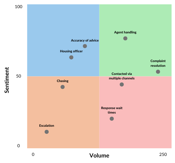
Plot that data on the chart, and wham! There’s your visual list of priorities and problem areas. If you’re curious, it should look something like this:

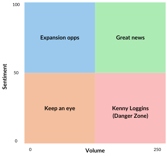
With your acceptable levels forming a quadrant on the graph, you can see where you need to focus your efforts both tactically and strategically. If we were to name the sectors, we could call them Expansion opportunities, Great news, Keep an eye, and Kenny Loggins (the Danger Zone). More traditionally, they could be labelled Opportunities, Strengths, Threats, Weaknesses. Pick your poison.

Data points in Keep an eye might well be from your previously determined Alerts categories — issues that aren’t huge in volume, but might constitute a threat to your customers or your organisation. Those in Great news might warrant a quick email to the team telling them what a good job they’re doing. Comparing these graphs period to period can also give you an idea of how much of an impact your activities are having.
But I’m getting ahead of myself. Because now it’s time for…
Action
Your goal with this stage of the framework is to understand the root causes of issues in order to determine how to act, and share those actions with colleagues across the business.
Knowing what to do with all this data you’ve collated is… how can I say this without dramatically understating it? It’s a big one. You’ve got priority areas you want to investigate further, but you now need to reach the point where you are able to inspire action in other teams using the data you’ve collected.
How we recommend approaching this stage is through conducting what we’d call a root cause analysis — start at the top, and (much like a 5-year-old questioning your decision to withhold sweeties) keep asking why. For this to work: start high level. What is your complaints handling sentiment? You can see the breakdown in your scatter graph of the subcategories that show you why it is where it is.
Now to dive into the muck. Underneath those subcategories lies yet another layer that shows you why they are where they are. Have I lost you yet?
This is where a lot of CX programs fall down. They either have some poor sod manually picking through every comment in every category (which is a great way to miss things due to human error or just cause that person enough misery to look for another job), or they have some kind of keyword categorisation in place (a clumsy system at best that saves you time at the cost of accuracy and certainty in your decision making). We use a linguistic model trained on UK housing data that leverages AI and corpus linguistics to achieve the same time-saving results with as much certainty as you could hope for from a well-fed, coffee-IV’d human being. But enough about us.
The idea here is that you find a way to break down the subcategories into individual issues residents are having — actionable items that can be judged on scale and severity, in accordance with the work you’ve done to this point.
The great thing about this: now you’ve gone through the process, you can flip it on its head. When reporting these stats to other teams or to your senior leadership, you can state the exact scale of each problem and how taking action on them will improve your risk, satisfaction score, and customer experience.
“Well that was a lot…”
My goal with this stage of the blog is to convince you that this is not an insurmountable problem and that you can, in fact, solve it without selling your soul to data scientists.
Yes, this may be a lot of work to set up on your own. But the cost of not doing so is too great to ignore. The TSM regulation means that all housing providers will be held to the same standard, and publicly. This is being done in the hope that it will encourage HAs to avoid the perception that they are not doing enough, but we feel the carrot is worth more than the stick here. The real goal is to improve the lives of residents, not to stay out of Michael Gove’s press statements.
So if you want to get a better idea of how the PAPA framework could be applied to your data, and how it could then improve the lives of your tenants, get in touch — we can offer a benchmark report on where your TSM surveys will place you, and provide an action plan on how to improve from there.


